
AI conversations and UI improvements
Two things happened this week worth sharing.
Reflecting on the Creative T event
First — I was part of a panel at Creative T's AI Edition, a small brunch event for women in the creative industry hosted by Silver Hare Creative. Under twenty of us in the room, and the conversation was honest in a way that bigger events rarely are.
What stood out most was the range of emotions. In one room: excitement, nervousness, anxiety, resentment — sometimes all from the same person. And that felt right. Because if anyone tells you AI is simply good or simply bad, they're either not thinking deeply enough about it or they're not being honest. The reality isn't black or white — it's shades of grey, and there's a lot of nuance we need to take into account. There are parts that are genuinely exciting and supportive. There are parts that challenge you. There are things that need serious ethical attention. And all of that is still developing — we're not at the end of the conversation, we're right at the beginning.
My biggest takeaway? Stay curious, stay critical, and keep having these conversations — especially with other creatives who are figuring it out alongside you.
Small edits, big improvements
Second — on the app side, we started applying some of the early UI feedback we've been gathering. Two updates this week: we cleaned up the invoices tab to make it clearer and more user-friendly (better status indicators, less friction to mark payments), and we streamlined the transfer calculator to show net transfer values instead of listing every movement back and forth. That last one was a big improvement — instead of telling you to move money out of an account and then back into the same account, the calculator now just shows you the net amount to move. Simpler, less confusing, fewer steps.
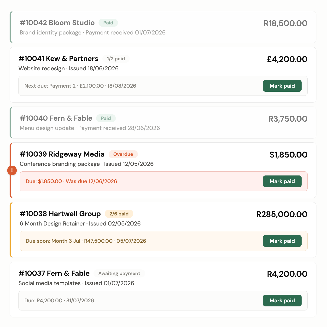
Small changes, big difference in how the app functions. That's the kind of refinement that only comes from actual user feedback and insights. To those of you who shared your thoughts — you know who you are — thank you. It makes a real difference. 🙌
What we're reading
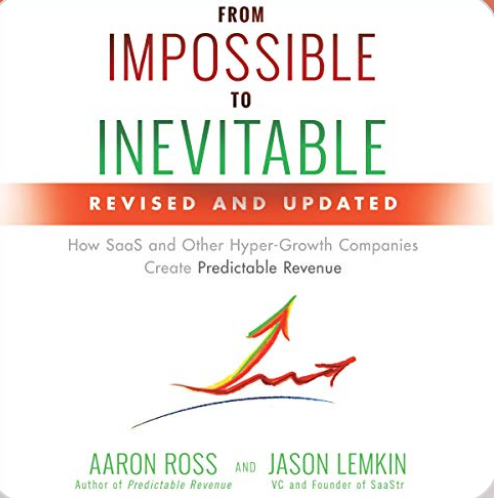
From Impossible to Inevitable — Aaron Ross & Jason Lemkin
Just started this one. Going to be honest — it's denser than any of the other books I've read so far, but definitely a good read. First big takeaway: the importance of niching down. At least we've got that one nailed.
Check it out →
What we're listening to
BigDeal with Codie Sanchez — Morgan Housel on Money
Morgan Housel is one of my money gurus. Love all his work. His idea that stuck with me from this conversation: health and money are the two things that impact your life whether you pay attention to them or not. The difference is that once you do start paying attention, everything shifts. That's the whole reason we're building this app — to make paying attention feel doable.
Check it out →